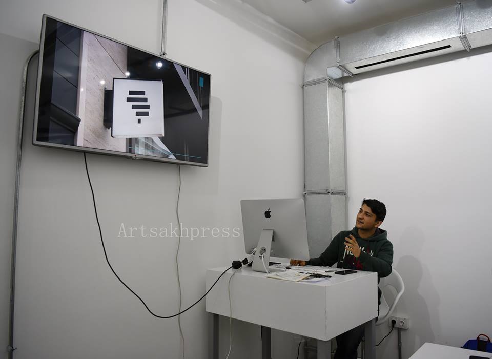
On to the proposal of “Artsakhpress” News Agency, a new logo has been created at Stepanakert’s Tumo Center for Creative Technologies, the author of which is Tumo’s student Vardan Karapetyan.
"Artsakhpress" News Agency has New Logotype
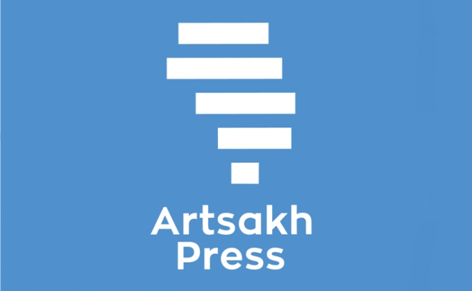
STEPANAKERT, MARCH 28, ARTSAKHPRESS: In an interview with “Artsakhpress”, Vardan Karapetyan noted that he is very happy that his job has been selected.
 "I am proud that my work has been selected as a logo for “Artsakhpress”. It is really a great honor and responsibility for me. I hope that the readers will also like the new logo, “ he said.
Speaking about the creation of the logo, he noted that he studied world-renowned media logos, for bringing it into line with international standards.
"Naturally, first of all I took into account the client's wish. I tried it to be simple.
After considerable thought and work I presented the following: I put zigzag squares of the flag of the Artsakh Republic on the map of Artsakh . It is similar to original lines, which symbolizes a note. The logo is blue, which symbolizes peace, "said the author, adding that it as a brand can be installed on notebooks, pens, bags, T-shirts and cards.